
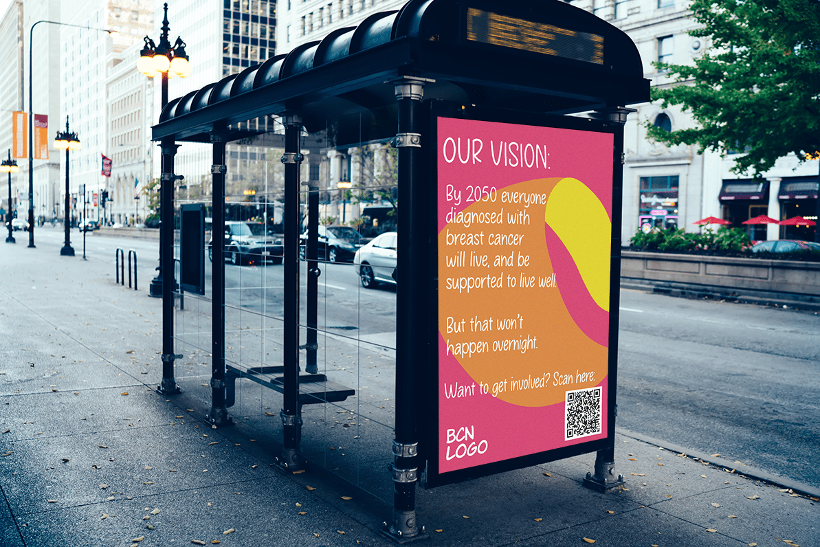
The above image is a mock-up.
To develop my understanding of brand identity, I decided to create my own brief to design two posters for Breast Cancer now under their current branding guidelines. I commenced research about Breast Cancer Now’s branding and explored the message they wanted to convey through their design decisions – for example, the colours chosen reflect the scope of the charities mission which is formed of both research and care.
Understanding Brand Identity
Brand identity is the way a brand portrays itself to their audience. It’s the combination of viusual and content choices that show the personality of the brand. The brand identity should make the brand recognisable across various products and formats, and is composed of several elements, such as:
- Colour Palette
- Typography
- Logo
- Layouts and Design
- Voice and tone (to reflect beliefs and values)
- Tagline
- Copywriting
A strong brand identity shows your audience what they can expect from the brand, and can often set the brand apart from its competitors. In the case of non-profit brand identity, it can portray the charity’s mission, ethos and vision.
The design brief
Since this was a self-led project, I generated my own design brief for this project.
Client Background:
-
- Breast Cancer Now is a UK-based charity dedicated to supporting those affected by breast cancer. They offer support services, fund research, and raise awareness about breast cancer prevention and treatment.
Project Overview:
-
- The objective is to create two visually engaging posters to promote Breast Cancer Now’s initiatives, raise awareness about breast cancer, and encourage support and donations.
Target Audience:
-
- Primary: Women aged 25-65, especially those with a family history of breast cancer or at higher risk.
- Secondary: Men and individuals of all ages interested in supporting breast cancer research and awareness.
Key Messages:
-
- Poster 1: Highlight Breast Cancer Now’s vision and encourage people to donate to support research, treatment, and patient support.
- Poster 2: Raise awareness about breast cancer and it’s symptoms. Encourage women to prioritize their breast health.
Design Style:
-
- Poster 1: Clean and inspiring. Utilize clear typography and make it easy for viewers to know how to support Breast Cancer Now.
- Poster 2: Emotionally impactful and informative. Incorporate symptoms of breast cancer to convey the message of early detection and screening importance.
Visual Elements:
-
- Incorporate Breast Cancer Now’s logo and follow their branding guidelines.
- Use a mix of typography, illustrations, and shapes to communicate the messages effectively.
- Use Breast Cancer Now’s new attention-grabbing colour palette (pink, orange, purple and yellow).
Call to Action:
-
- Include a clear call to action on the first poster, directing viewers to visit the Breast Cancer Now website for more information, support, and donation opportunities.
Specifications:
-
- Poster Size: A3 (297mm x 420mm) or larger, suitable for both print and digital distribution.
- High-resolution files suitable for printing and online sharing.
- Provide editable files for future updates or adaptations.
Additional Notes:
- Ensure designs are culturally sensitive and inclusive.
- Prioritize accessibility in design choices, including font legibility and contrast.
- Maintain consistency with Breast Cancer Now’s existing marketing materials and messaging.
By adhering to these guidelines, the posters will effectively communicate Breast Cancer Now’s mission, engage the target audience, and drive action towards supporting those affected by breast cancer.
The design process
After creating the brief, I then started to collate images of BCN’s range of branded assets and materials to determine the common themes and understand their brand identity better. I wanted to create posters that were in line with BCN’s established brand guidelines, although this was a little tricky to determine on my own. To get a clear understanding of BCN and inspire some design ideas, I created a mood board using Canva. This helped my to identify the key design features that were consistent across BCN’s assets and decide which of these I wanted to include in my posters.
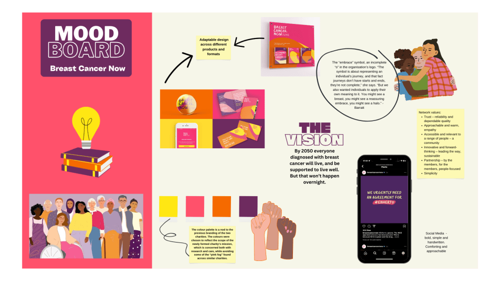
Mood board, designed using Canva.
Communicating BCN's Vision
For the first poster, I wanted to highlight Breast Cancer Now’s vision, as outlined in the brief. I wanted this to be the main element of the poster, catching the eye of the viewer. I had a couple of ideas for encouraging people to donate:
- Include a web address at the bottom of the poster
- Include a QR code
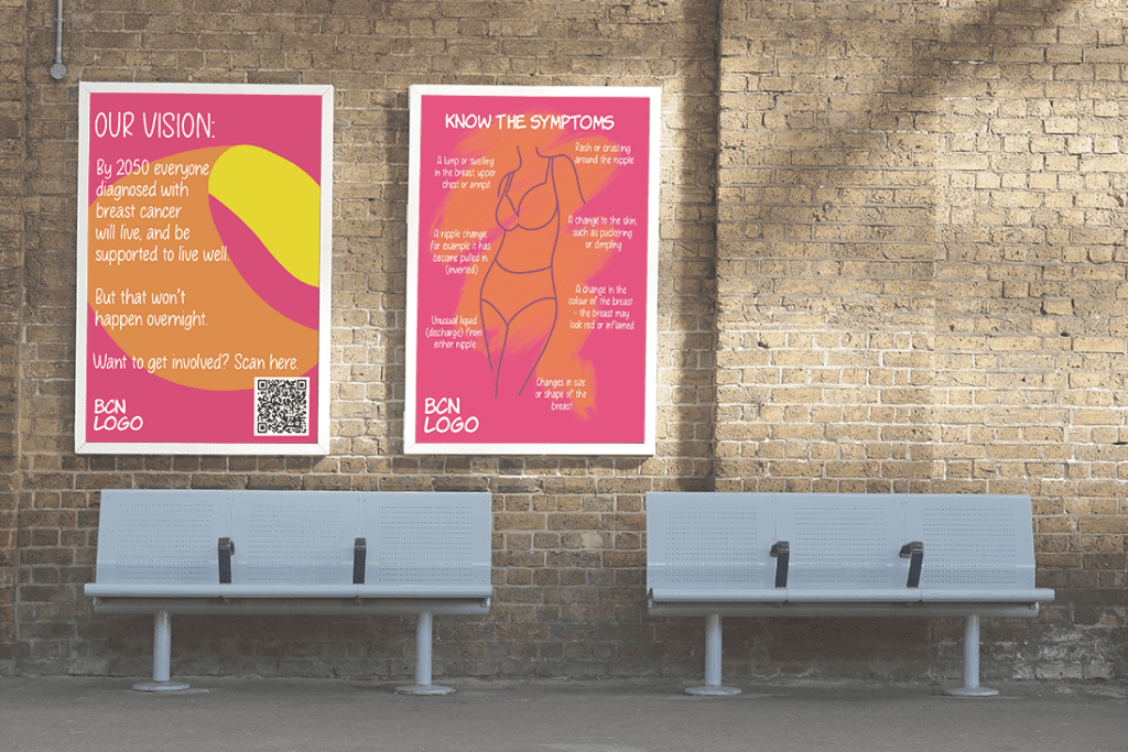
The brief asked for a clean and inspiring design, utilising clear typography and making it easy for viewers to know how to support Breast Cancer Now. I browsed the BCN website and drew inspiration from posters they had available to download. I decided to use their existing background design for the base of the poster in order to stay consistent with their branding and increase brand recall in their audience. The bright pink with playful orange and yellow graphic shapes are eye-catching and would stand out in most environments, especially on OOH formats.
The Breast Cancer Now logo was an important aspect to include in the poster design, and I felt that it was best aligned to the bottom left of the poster due to the alignment of the text in the logo. I used typography that was consistent with their current branding, which is a friendly handwritten type. Although I didn’t know the exact type font they use within their branding, I was able to find a similar font that matched very well.
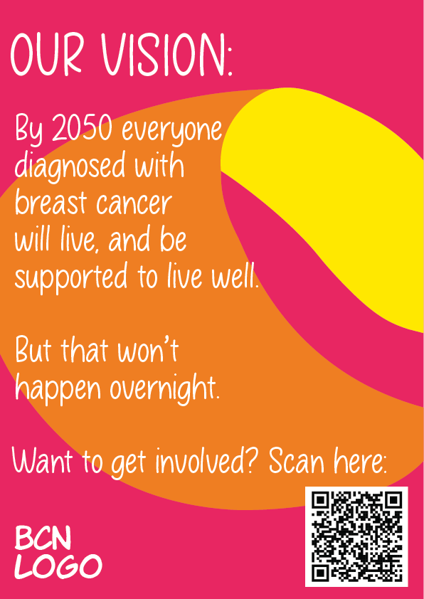
Poster 1, Aim: Communicate Breast Cancer Now’s vision with a call for action.
The result was the above poster, which I designed in Adobe Photoshop and effectively communicates BCN’s vision. It adheres to their branding guidelines through the use of the colour palette, typography, logo and design style. I also decided to include a QR code that leads to the BCN fundraising page in order to engage the audience and make it easy to donate. I ensured that the type was large enough to be accessible to all audiences and was against the darker background colours so that it is easily readable.
Raising awareness of symptoms
The aim of the second poster was to raise awareness about breast cancer and its symptoms, encouraging women to prioritize their breast health. This suggested that the poster should inform people about the symptoms of breast cancer, whilst still being impactful and eye-catching.
I therefore researched the symptoms of breast cancer, as described on BCN’s website in order to maintain consistency of information. I wanted to incorporate the symptoms of breast cancer in a visually interesting way, also helping to convey the message of early detection and screening importance.
Similarly to the first poster, I made the decision of aligning the logo in the bottom left, and using a type font that is used consistently within their branding. I also created an illustration in Adobe Illustrator to add visual appeal to the poster and catch the eye of BCN’s target audience.
Placing this atop of a an orange brush stroke was a way of symbolising the individual’s journey, in the same way that this is symbolised by the incomplete ‘0’ (embrace symbol) in the BCN logo.
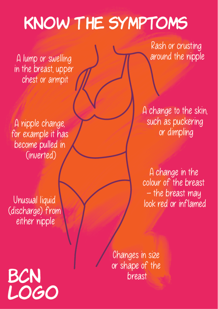
Poster 2, Aim: Raise awareness of the symptoms of breast cancer.
The result was the above poster, which I designed in Adobe Photoshop and Illustrator. It adheres to their branding guidelines through the use of the colour palette, typography and logo, but has pushed the creative boundaries in terms of design style. BCN does not normally use illustrative or painterly elements, but I think this could be a great way to communicate the individuality of each person’s journey with breast cancer.
The first draft of this poster had smaller text for each of the symptoms, and feedback from my peers suggested that it wasn’t easily accessible. I therefore adjusted the size of the font to better the legibility of the design. The final design is informative, easy to understand, and eye-catching.
The above image is a mock-up.